Cartier, Fancy Cut & Brilliant Cut
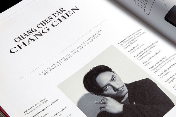
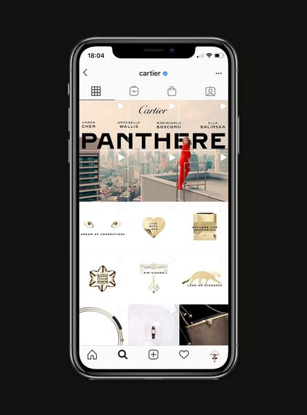
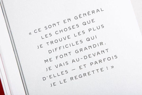
To bring unity to Cartier’s visual language, we designed exclusive typographic families based on historical archives. The Fancy Cut serif and the Brilliant Cut sans-serif are now the pillars of the brand’s identity, from jewellery and watches to fragrances and accessories.
Credits
photos : Emmanuelle Lubaki © Yorgo&Co
Type of work:
Related clients: